
YouTube BrandConnect Marketplace App
TL;DR
I had a year-long engagement on the YouTube account while working as a Senior Product Designer at Free Association. Our agile team consisted of a Product Director, a Senior Lead Product Designer and myself.
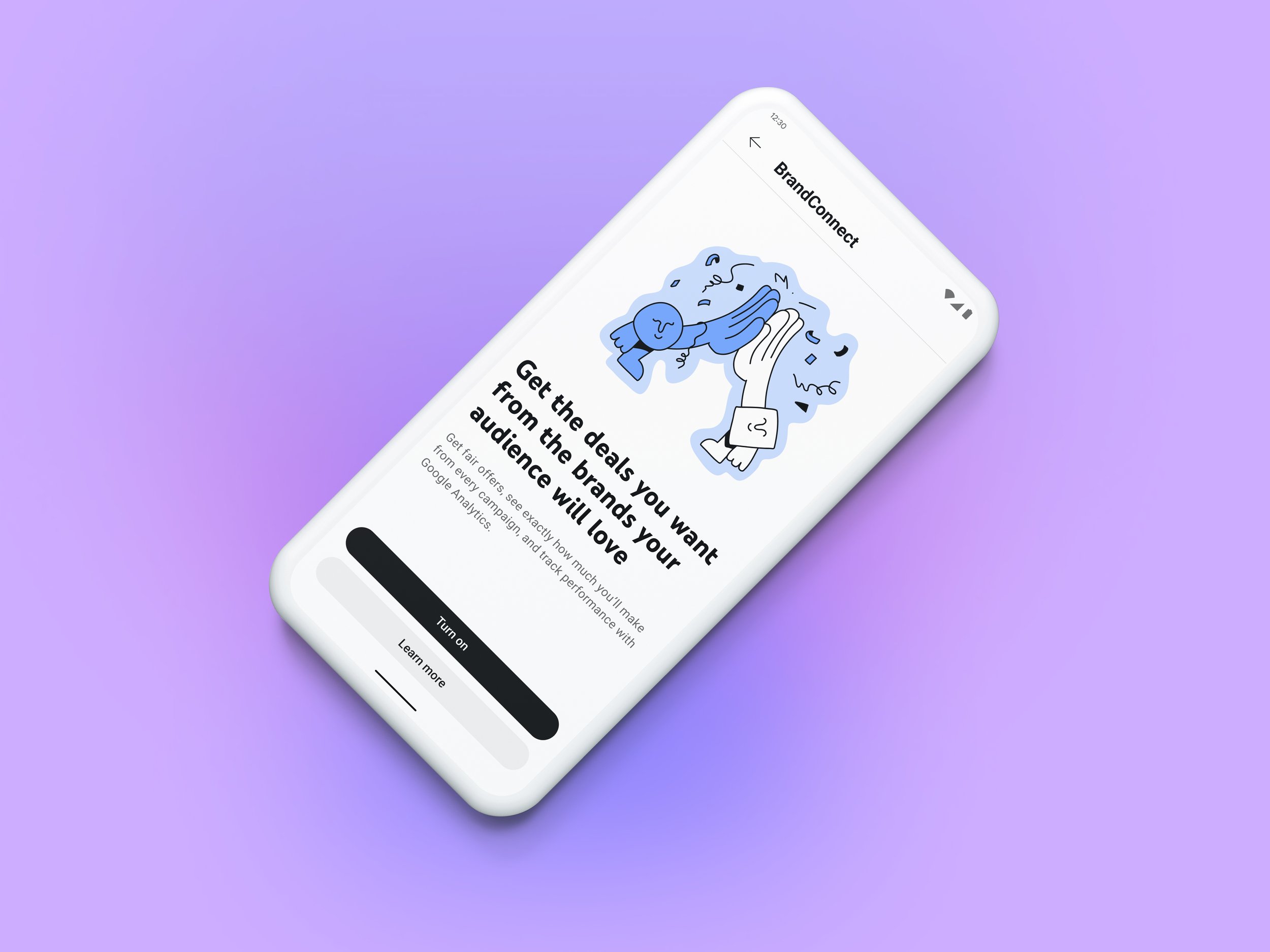
We partnered with the BrandConnect Marketplace team in developing a platform where creators and brands could seamlessly connect and negotiate brand-sponsorship deals in a safe and equitable space. Post launch of BrandConnect’s MVP desktop web experience, we were brought in to envision the experience for native mobile, while informing feature evolution on desktop.
PROBLEM
Fragmented ecosystem – influencer marketing was fragmented, with brands and Creators struggling to find suitable partners efficiently.
Lack of trust – up until now, brand deals happened in a grey market space, leaving both Creators and brands open to a great deal of risk.
Imbalanced power dynamic – Creators felt unsupported and lacked the power or equity to effectively negotiate deals for themselves.
GOALS
Create a self-serve, automated platform
Bring humanity to a currently transactional marketplace
Resolve pain points effectively to get market fit
IMPACT
Improved usability and engagement for the desktop MVP through user testing, increasing retention by 36%.
Helped establish a safer, more equitable marketplace by addressing key trust and negotiation pain points.
MY ROLE
UXR & Discovery
Content Architecture
UI / Visual Design
User Testing
Design System Management
Prototyping
PLATFORM/S
Android
iOS
Reference Screens
Things to consider:
YouTube BrandConnect platform was very MVP – they didn’t have the bandwidth to really consider the visual look and feel of the user interface.
Taxonomy was confusing – there wasn’t clear language to differentiate between an offer and an active campaign; both were referred to as ‘campaign details’.
Web design system was outdated compared to their newer YouTube Studio mobile app.
Goal was to obtain parity between the two touchpoints.

Design Thinking
We mapped out the main user journey from getting a new offer and signing an agreement, to uploading and submitting a video, to receiving payments once the video went live and completing a campaign.
We created wireframes of the main user journey, detailing the hierarchy of information on each screen, with essential tasks and information.


Applying Our Learnings
We created a first-pass of the main customer journey on mobile that we would then user test.
Screens are from each phase of the campaign flow. Because of limited real estate on mobile, we were mindful of surfacing the most pertinent data and using progressive disclosures.

Usability Testing
Opportunity areas / what we learned:
Any blurriness or lack of details in the copy around pricing and expectations can easily create a negative mental model.
Instilling trust is of utmost importance. Creators get scammed a lot and are weary of a brand’s motives.

Final Screens
Small refinements to address brand inconsistencies in the copy significantly improved the transition from first notification to seamless in-app experience.


North Star Flow
*
North Star Flow *